← All selected work

Poster archive / 01—06

One format.
Six different problems.

A collection of real and self-directed poster projects exploring event promotion, emerging technology, advocacy and place.

01 / Exhibition

Night Owl Designers

Used publicly

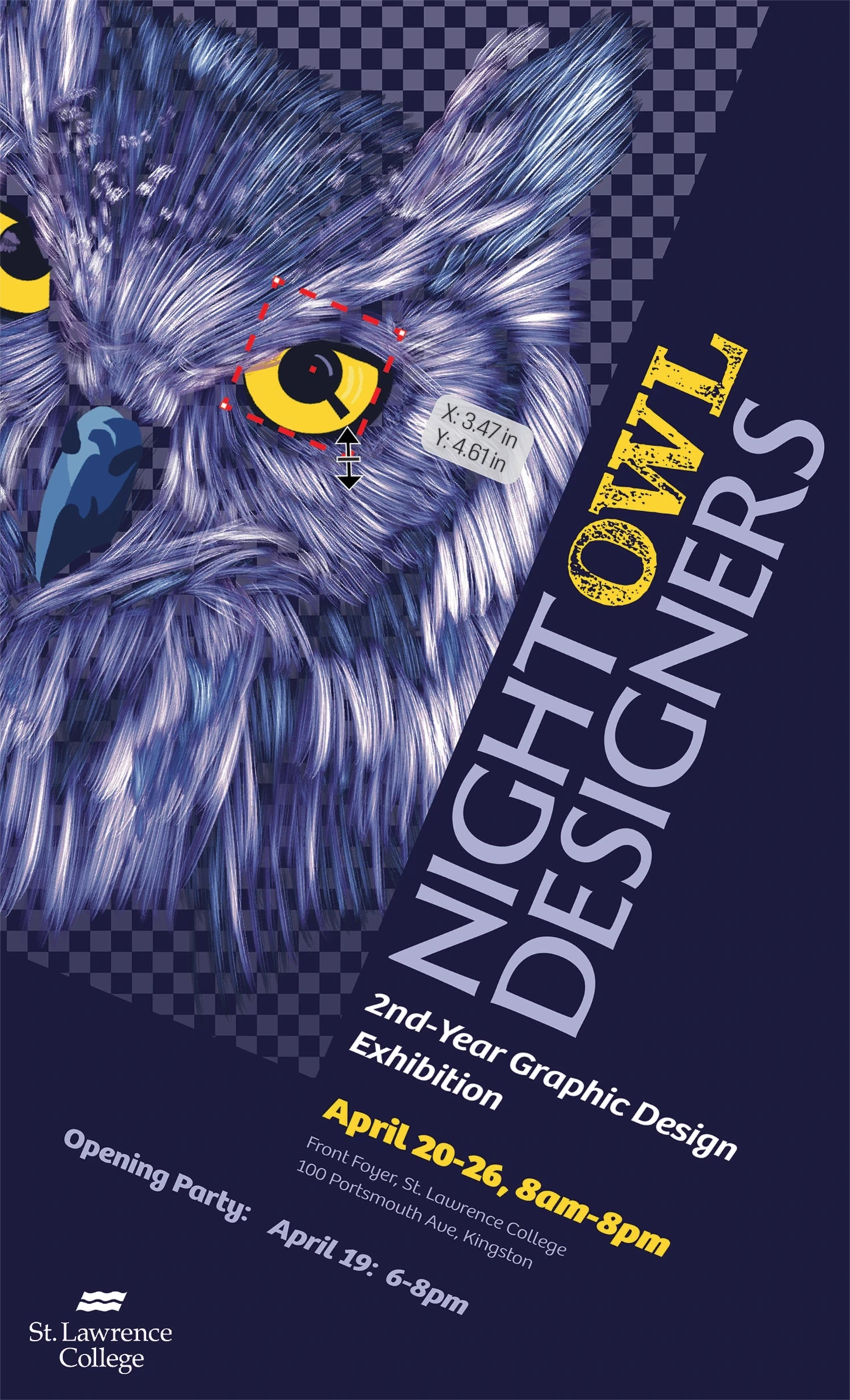
Created in 2024 for the St. Lawrence College second-year Graphic Design Exhibition, this poster began with a naming challenge: develop a title that captured the shared experience of the graduating class of 2025, then build the event’s visual direction around it.

“Night Owl Designers” reflected the many late evenings spent refining projects and working toward deadlines. The central owl began as an experiment in Procreate using a textured brush that created hair-like strands. It was then developed further in Adobe Illustrator with visual references to the design process, including a checkered artboard, vector eyes, a magnifying-glass pupil, a geometric beak, cursor and coordinate readout.

The typography follows a strong diagonal axis, giving the composition movement while connecting the event title and supporting information. A decorative display typeface reinforces the nocturnal personality, while a clean sans serif establishes a clear hierarchy for the exhibition details.

The final poster needed to communicate that this was a graphic design exhibition while appealing to students, designers, artists, families, faculty, recruiters, potential clients and the wider Kingston community.

Night Owl Designers exhibition poster

02 / Conference

Tech Trail Blazers

Self-directed project

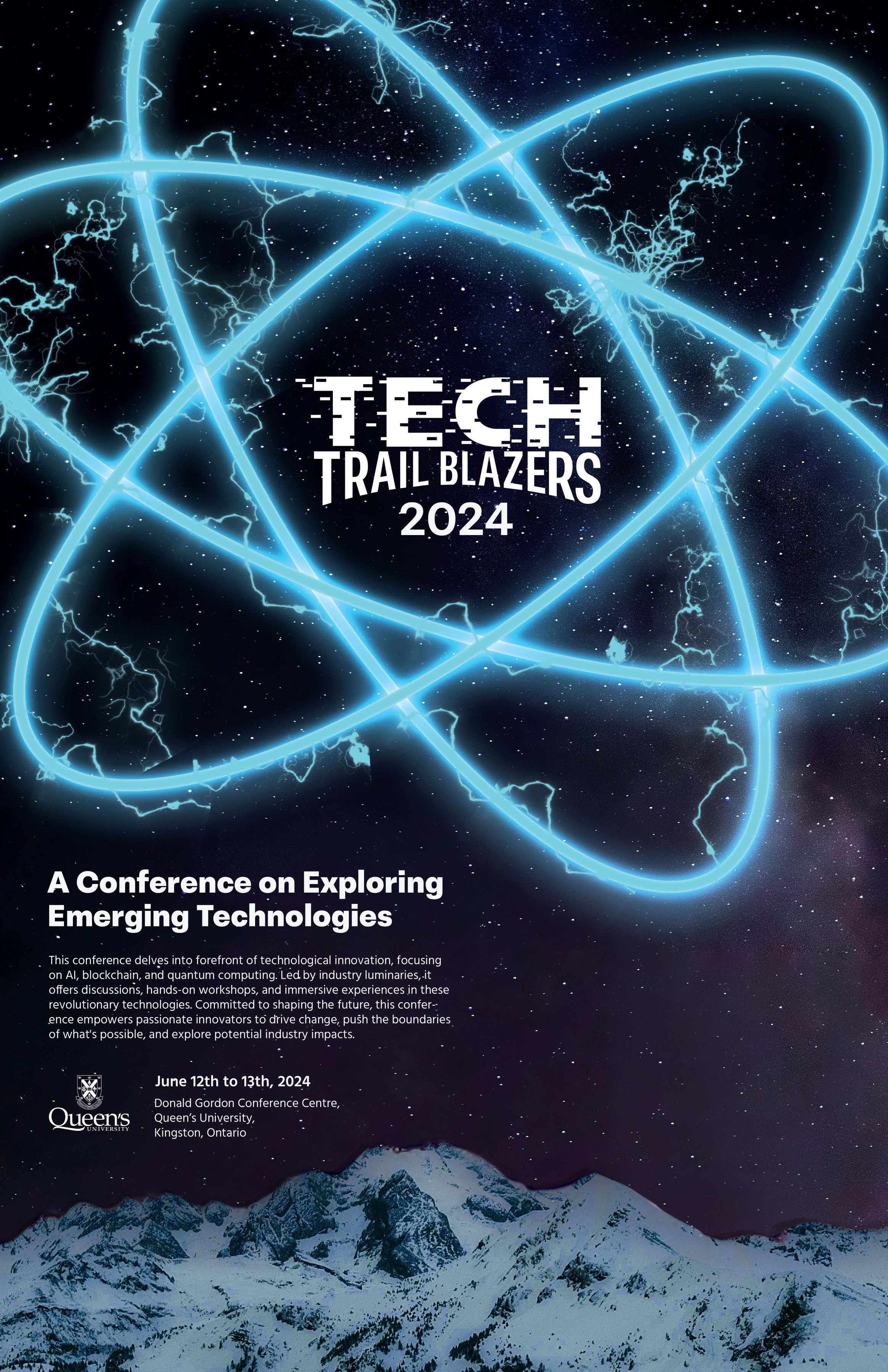
Created in 2024, Tech Trail Blazers was an academic conference-promotion project exploring how different designers could interpret the same assigned topic. At least three students received each conference theme, allowing the class to compare the distinct concepts, visual directions and communication strategies developed from a shared brief.

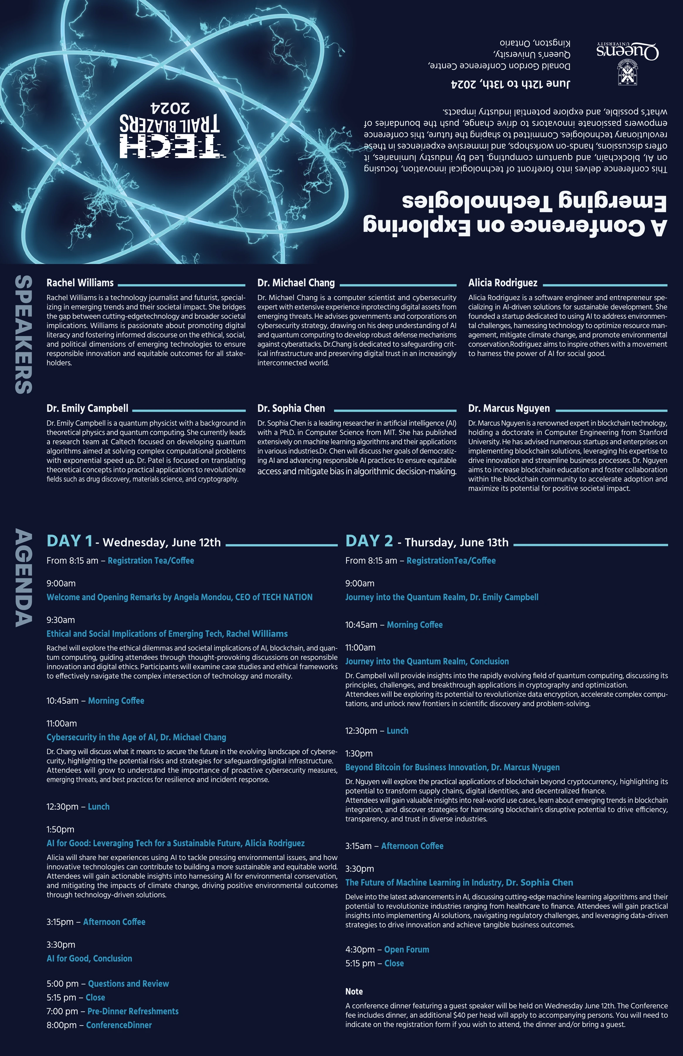
The final piece is a double-sided poster that folds down to letter size, allowing it to function as a self-mailer. The front serves as both event advertising and a keepsake, while the reverse organizes the conference’s more detailed content, including the featured speaker’s background, presentation topic and event schedule.

The project tested information design, typography and the efficient use of space when working with a large amount of supplied copy. The upper quarter of the reverse side is intentionally upside down. When folded, this section becomes the first information recipients see and establishes the correct orientation for unfolding directly into the poster. The piece can then be turned over to access the complete conference information.

The visual direction was developed for curious, forward-thinking attendees interested in emerging technology and innovation. The intended audience included Queen’s University students and staff, event stakeholders, technology professionals and visitors travelling from cities such as Toronto and Ottawa.

Front of the Tech Trail Blazers conference poster

03 / Advocacy

Say “No” to Shark Finning

Self-directed project

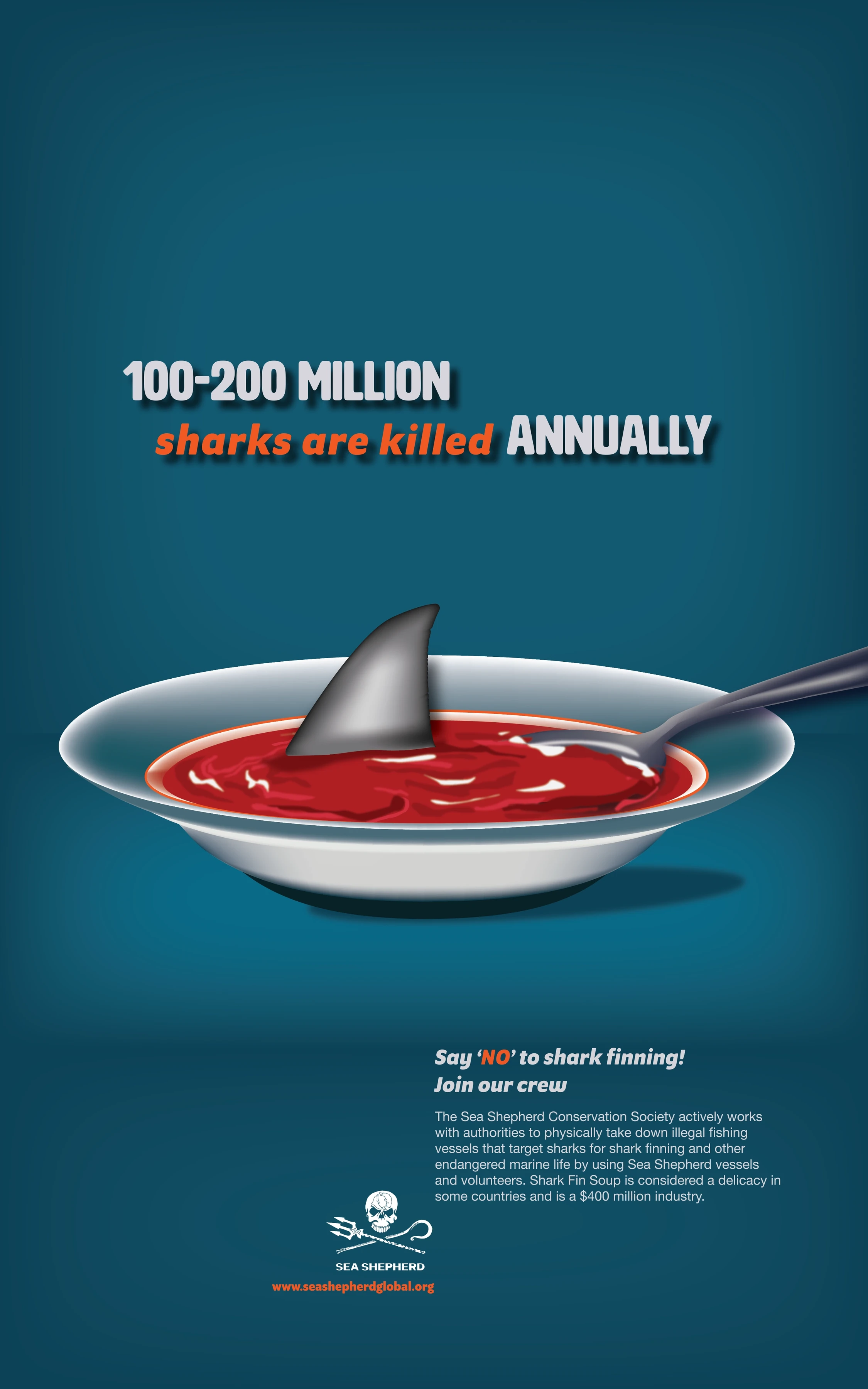
Created in 2023, Say “No” to Shark Finning was an academic advocacy-poster project developed around a cause of the designer’s choosing. Inspired by an earlier high-school art project, the concept revisited anti-shark-finning advocacy through a more refined digital approach, with the final artwork created entirely in Adobe Illustrator.

Shark finning was selected because the practice and its environmental consequences are not always widely understood. Driven largely by demand for shark-fin soup, the trade contributes to the killing of sharks for their fins and places additional pressure on marine ecosystems. The poster was designed to make the issue immediately recognizable and encourage viewers to consider an animal-welfare concern that can otherwise feel distant or invisible.

The concept was developed as a self-directed campaign for the Sea Shepherd Conservation Society because of the organization’s established work opposing illegal fishing and protecting marine wildlife. It was not commissioned by or formally affiliated with Sea Shepherd.

The intended audience included environmental advocates, animal and ocean lovers, shark enthusiasts, scientists, policymakers and members of the public interested in marine conservation. The direct message and focused visual treatment were intended to create urgency while remaining clear enough to communicate quickly in a public setting.

Say No to Shark Finning advocacy poster

04 / Exhibition

Third-Year Graphic Design Exhibition

Unused proposal

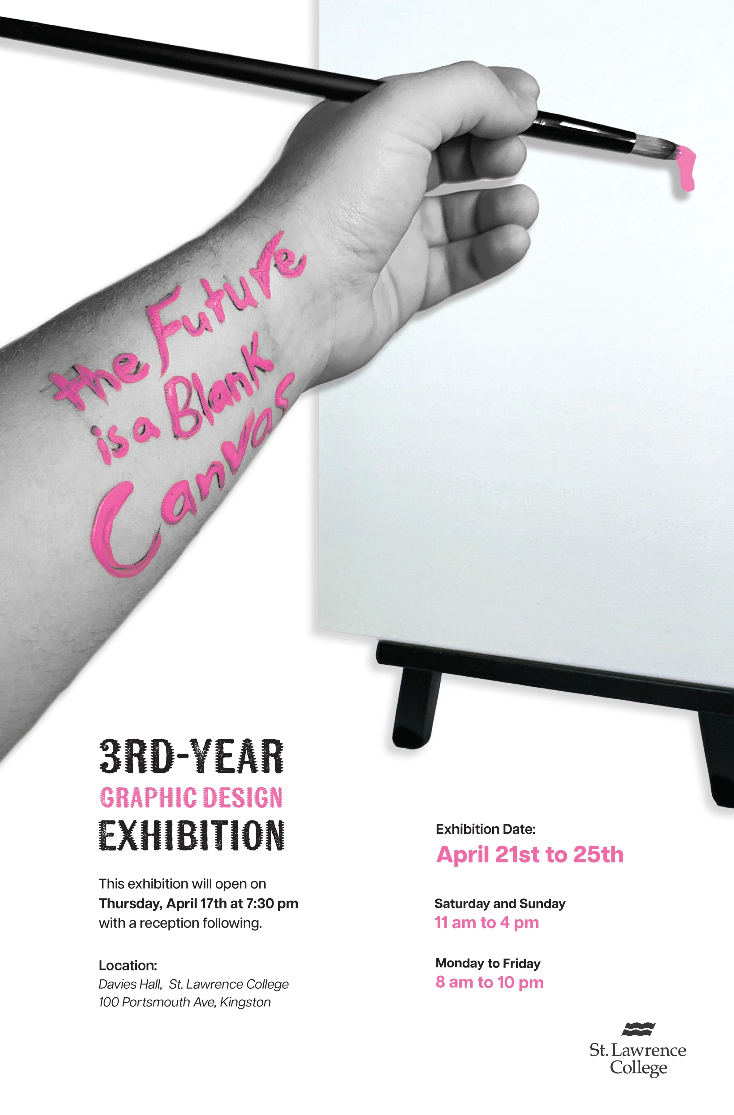
Created in 2025, The Future Is a Blank Canvas was proposed as the promotional poster for the St. Lawrence College third-year Graphic Design Exhibition. The brief required a play on words that could be translated into a concept using physical media, with photography and digital editing permitted during production.

The title reflects the uncertainty and possibility that come with finishing school. A blank canvas represents the opportunity to define your own future, choose a direction and continue pushing toward your personal and professional goals.

The artwork combines painting and photography in a digitally assembled composition. Two separate photographs were carefully cropped and blended to appear as one continuous scene, bringing the physical and digital elements together without losing their handmade quality. The project also provided an opportunity to step outside a familiar colour palette by introducing a bold pink as the only dominant colour. Against the primarily black-and-white composition, it creates an immediate focal point and helps the poster attract attention from a distance.

The intended audience included St. Lawrence College students, graphic designers, artists, families and friends of the graduating class, faculty, college stakeholders, recruiters, potential clients and members of Kingston’s wider creative community.

St. Lawrence College third-year Graphic Design Exhibition poster

05 / Travel

Santorini, Greece

Self-directed project

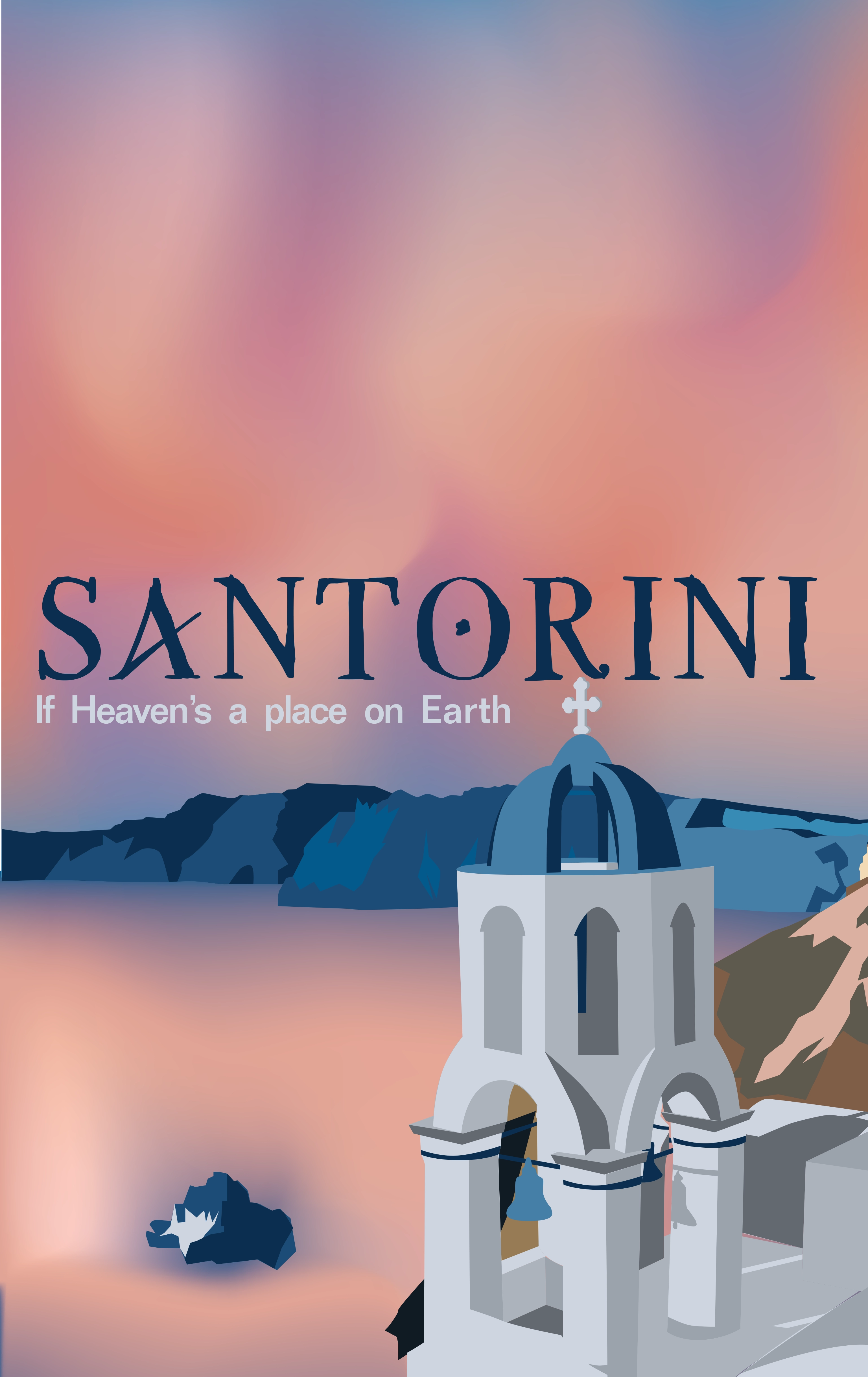
Created in 2023, Santorini, Greece was an academic travel-poster project based on a destination the designer had always wanted to visit. The brief was to create an advertisement for a fictional travel agency using only Adobe Illustrator.

The visual direction focuses on the architectural character most closely associated with Santorini: whitewashed buildings, rounded forms and vivid blue accents overlooking the Aegean Sea. These recognizable elements were simplified into a clean illustrated composition intended to communicate the destination immediately while capturing its bright, coastal atmosphere.

The poster was designed to inspire travellers and position Santorini as an appealing destination for those interested in architecture, culture, scenery and local experiences. Its primary audience included prospective tourists, couples, families and people researching international travel.

In a real travel campaign, the broader stakeholder group could include the travel agency, its investors and partners, tourism organizations, local government, hotels, short-term accommodations, restaurants, shops and other businesses supported by visitor activity. Although the project was self-directed, considering these different interests helped frame the poster as destination marketing rather than simply a decorative illustration.

Santorini, Greece travel poster

06 / Music and culture

International Jazz Day

Self-Directed Project

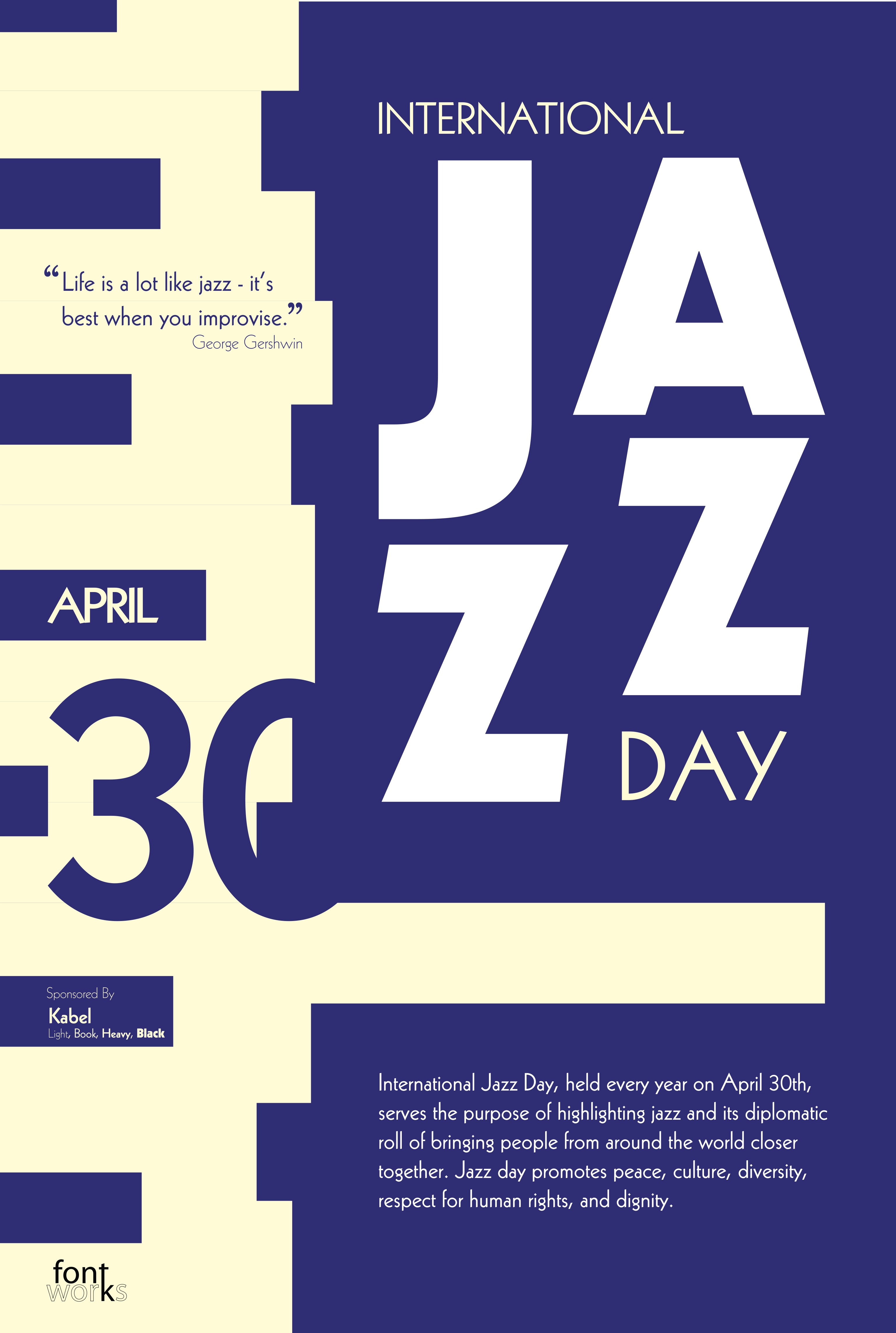
Created in 2024, this poster was part of an expressive-typography project based on a commemorative day of the designer’s choosing. International Jazz Day offered an opportunity to translate the energy, rhythm and improvisational character of jazz into a type-led composition.

Oversized letterforms, dramatic cropping and irregular shifts in scale create a syncopated visual rhythm across the page. Rather than following a rigid reading path, the typography encourages the viewer’s eye to move between the title, date, quotation and supporting information—reflecting the spontaneity and variation associated with jazz performance. A limited navy-and-cream palette keeps the composition unified while allowing the contrasting type sizes and weights to establish hierarchy.

The poster balances expressive experimentation with the practical need to communicate the occasion and its purpose. International Jazz Day celebrates the music’s cultural influence and its ability to connect people across different backgrounds and communities.

The intended audience included jazz listeners, musicians, music students, performers and people interested in arts and culture. The bold typographic treatment was designed to catch attention from a distance while rewarding a closer look at the supporting message.

International Jazz Day poster