OWEN DENESUIK
Horizon Energy Plus
PACKAGING | BRANDING — 2026
About The Project
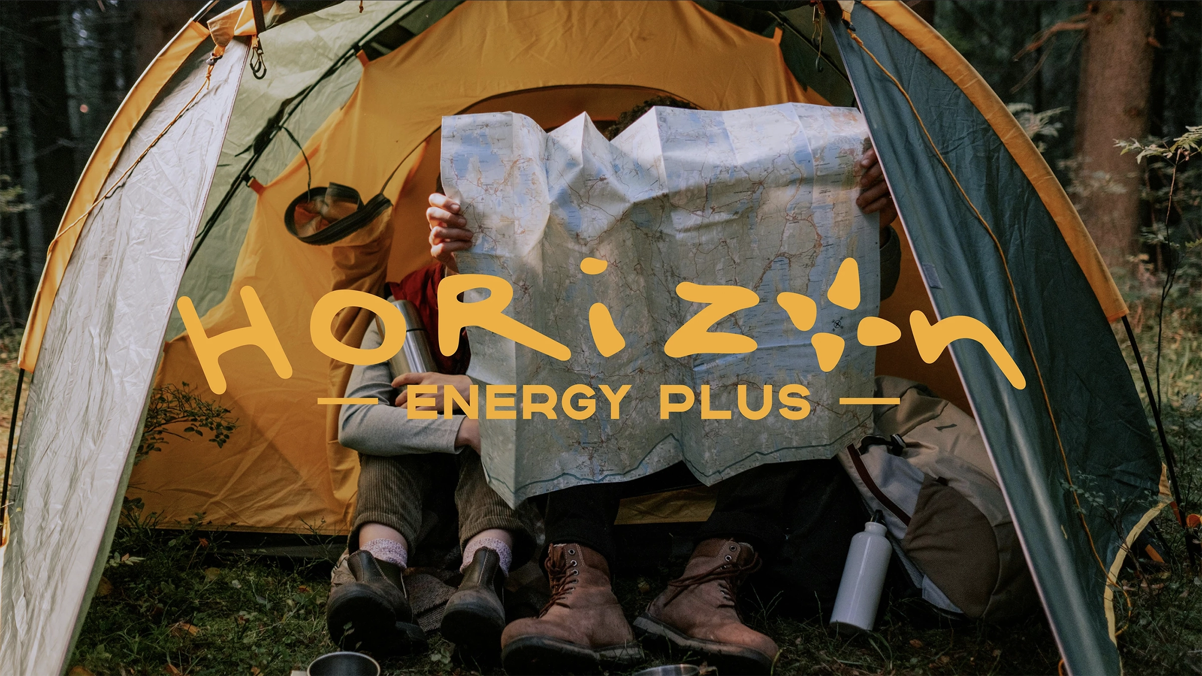
Horizon Energy Plus is a conceptual branding and packaging project created as a mindful alternative to traditional energy drinks. Designed for outdoor explorers and active consumers, the brand focuses on natural ingredients, portability, and a more sincere approach to energy-focused branding.
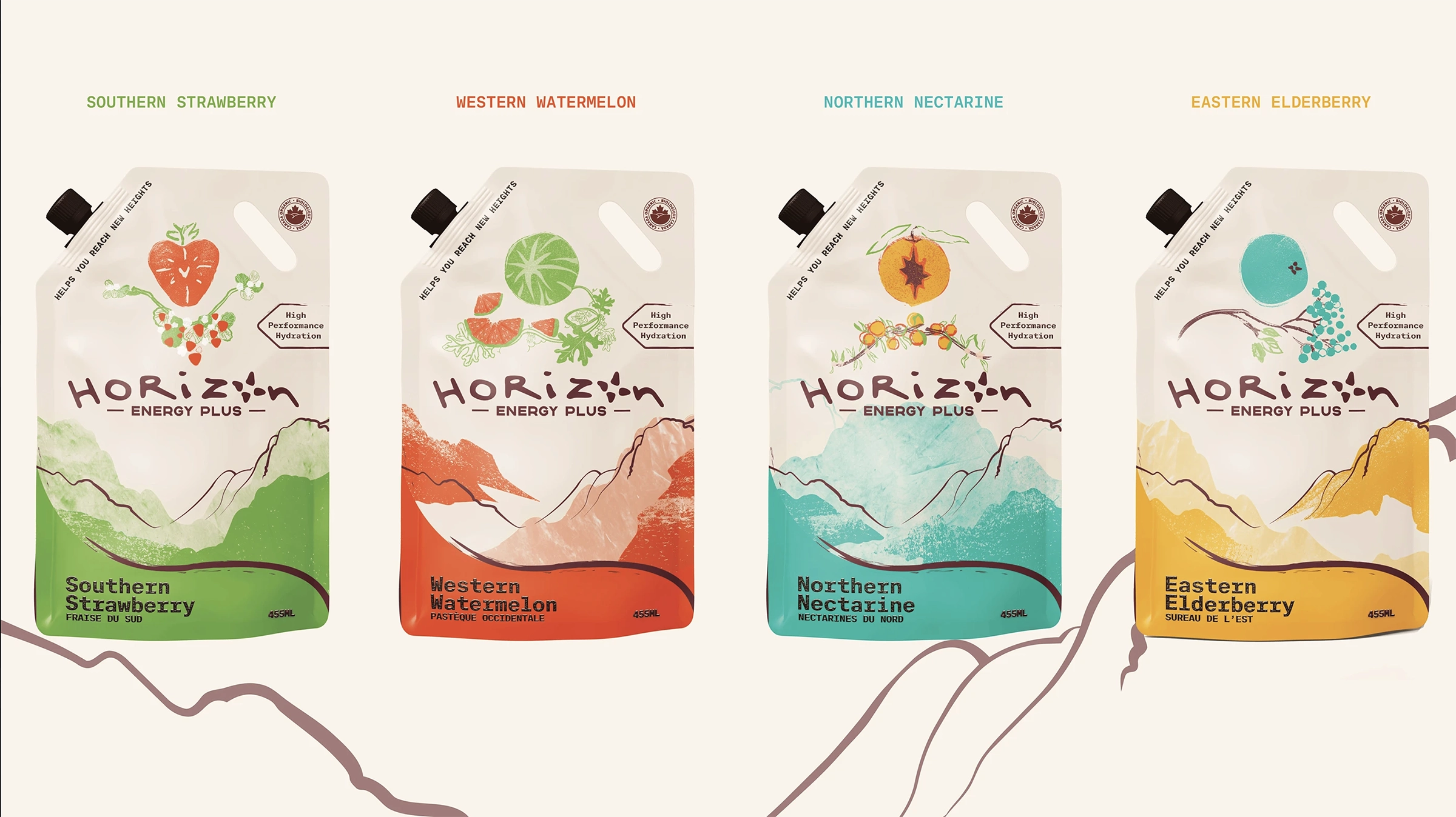
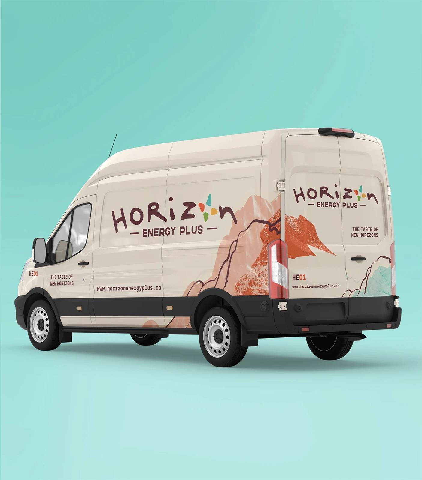
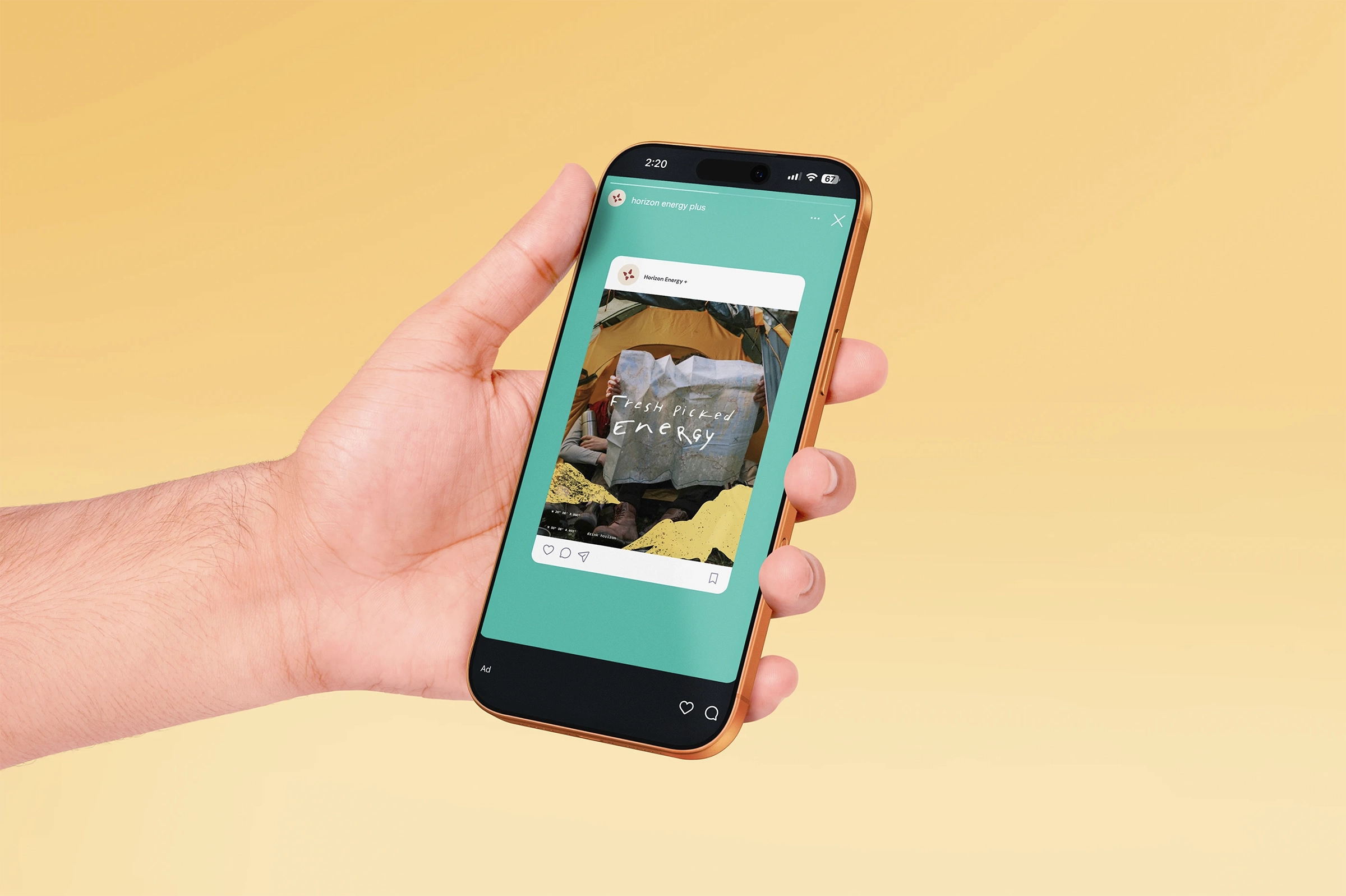
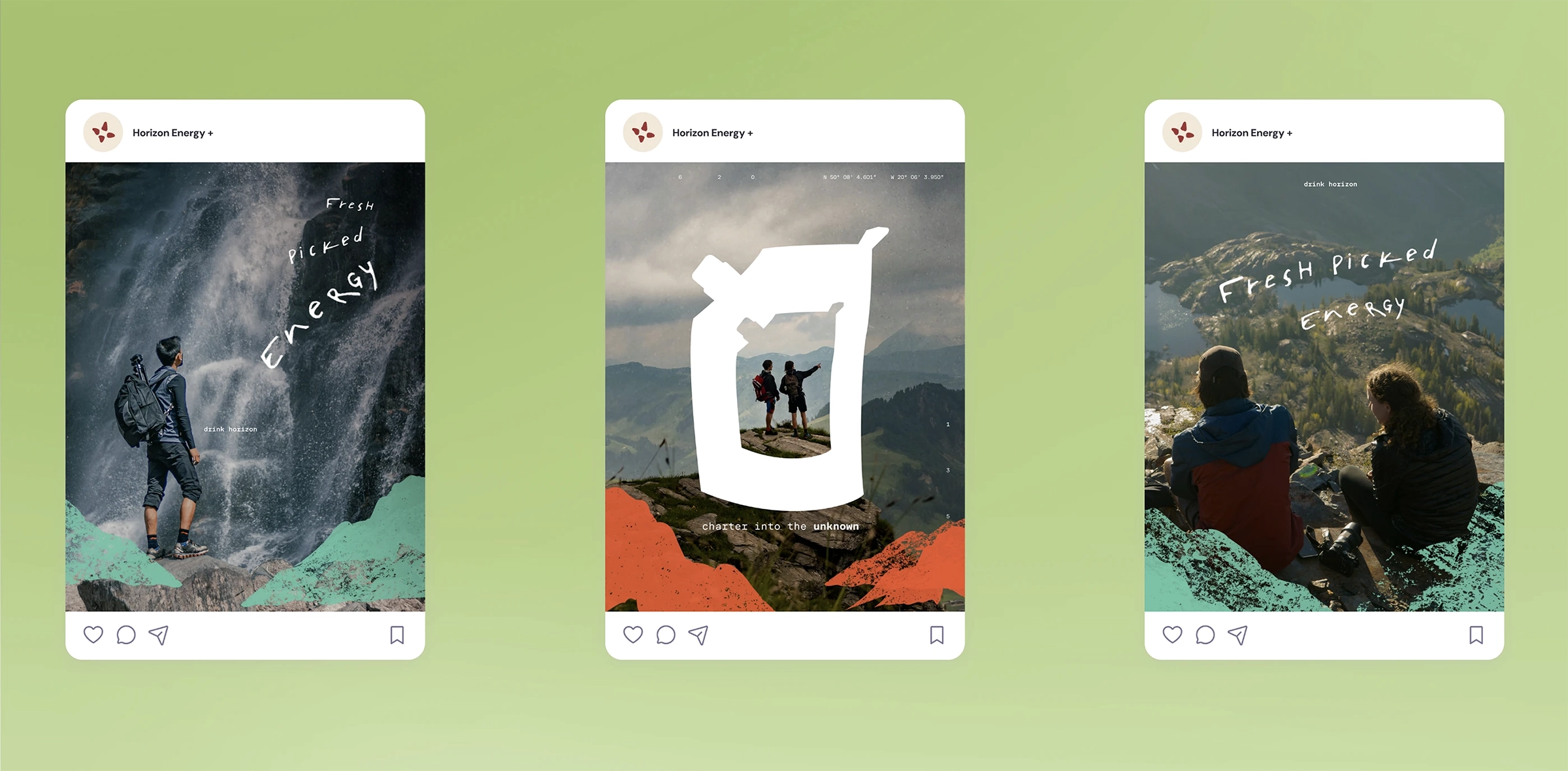
The visual identity combines adventurous storytelling with a handcrafted and approachable aesthetic. A custom wordmark inspired by free-spirited handwriting was paired with an abstract compass rose symbol to reinforce themes of exploration, movement, and travel. The brand system was further expanded through textured illustrations, earthy visual assets, and a vibrant colour palette tied to the four cardinal directions.
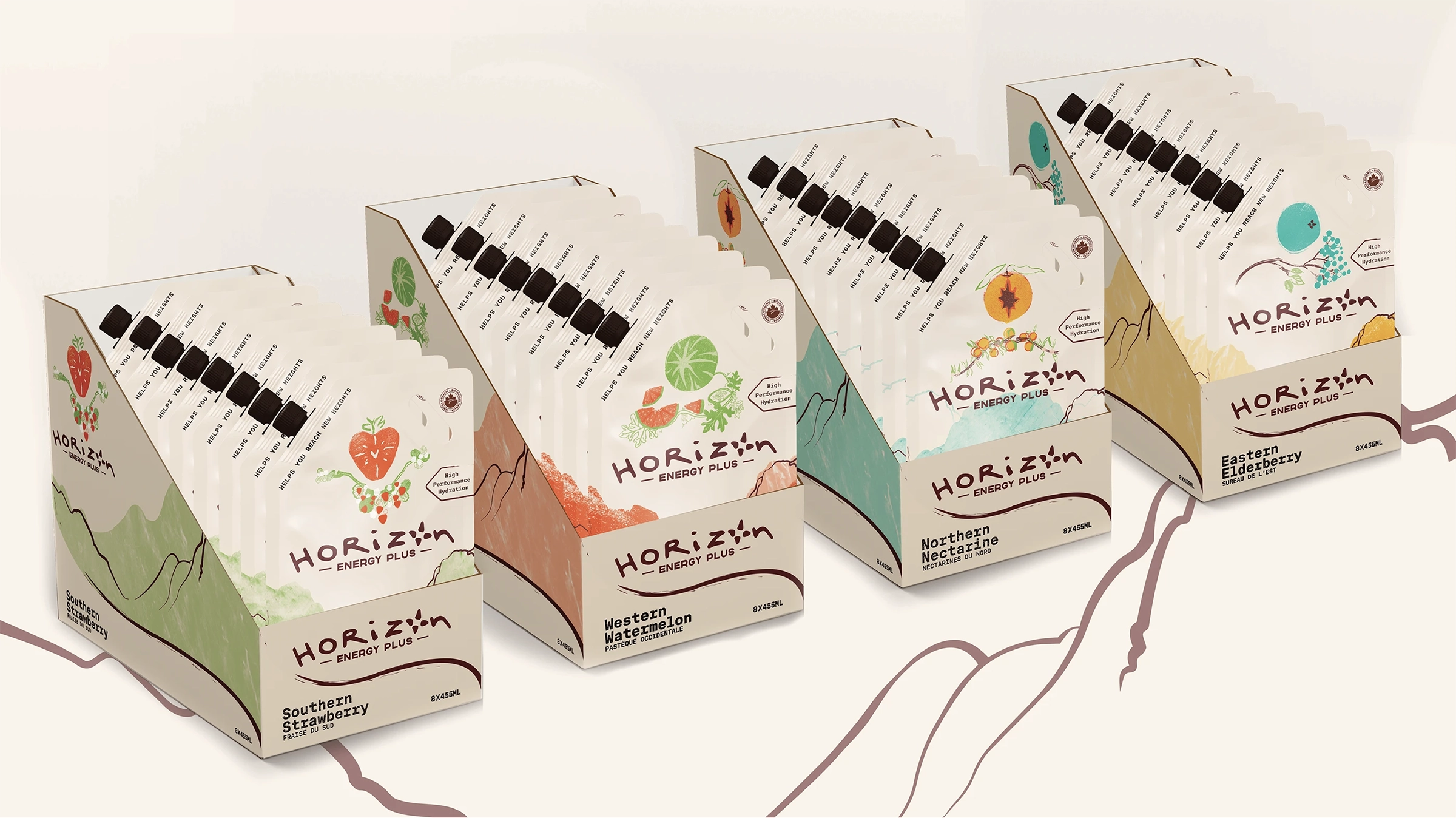
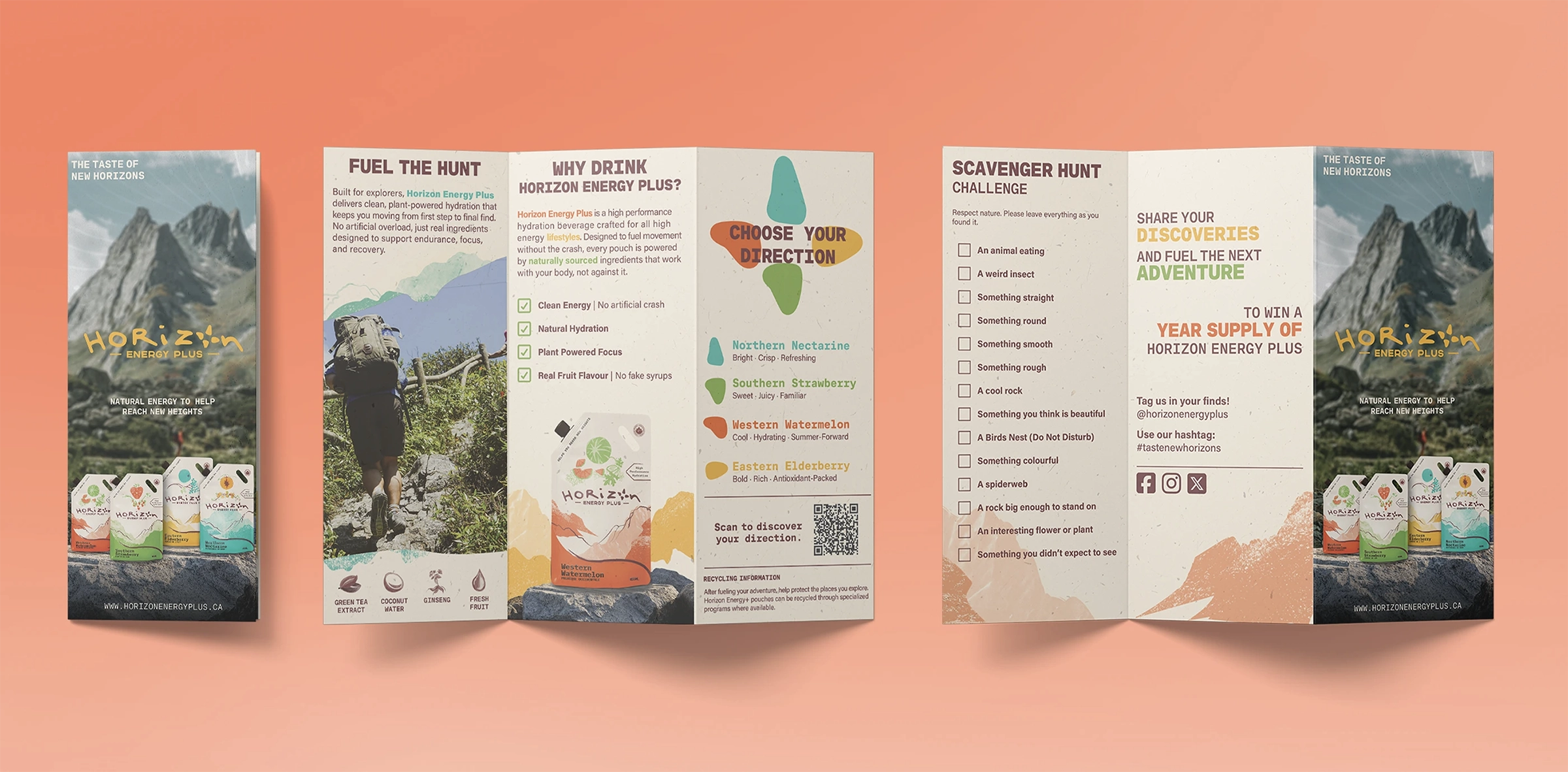
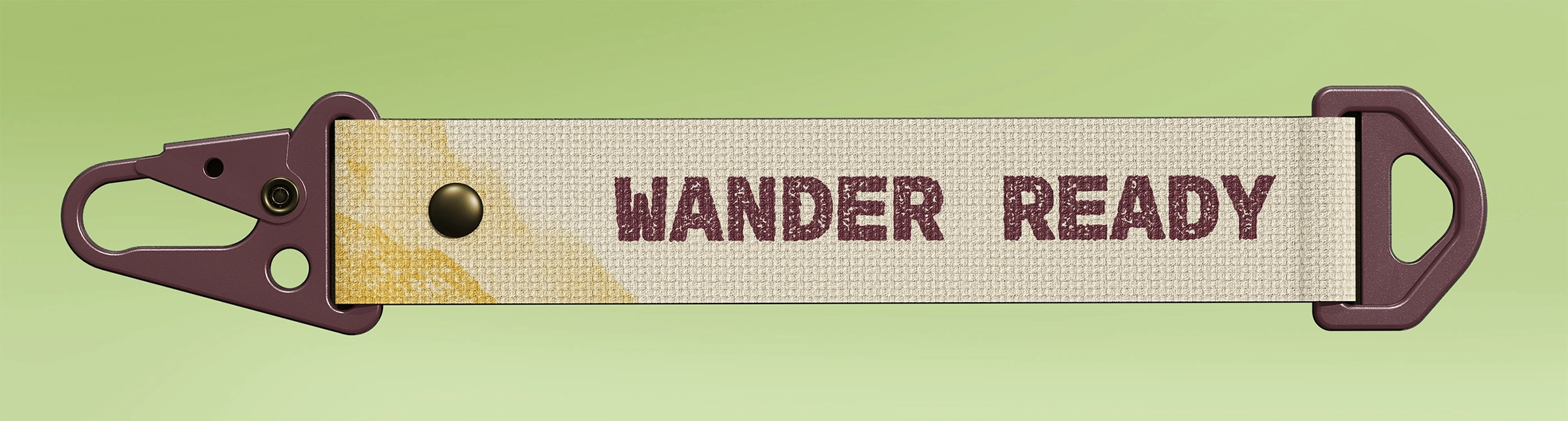
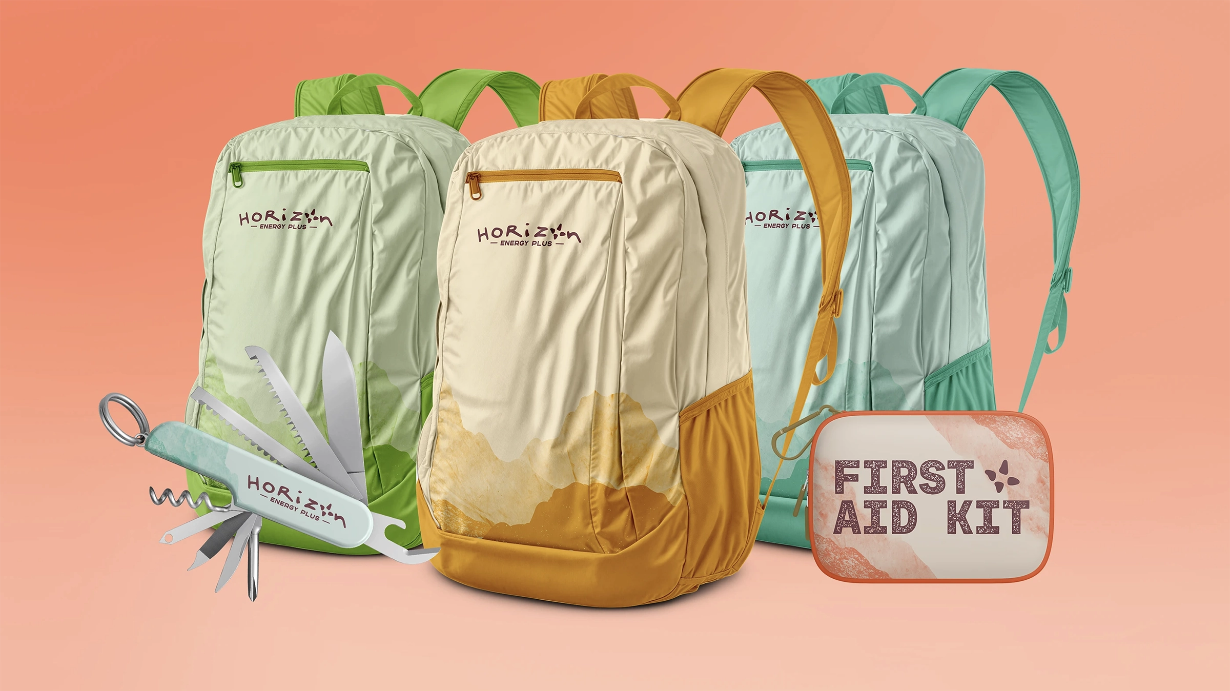
Rather than using traditional aluminum cans, Horizon Energy Plus was designed around portable beverage pouches that could easily attach to bags and outdoor gear using carabiners. The project also included a brand activation campaign featuring a scavenger hunt experience designed to encourage community participation and outdoor exploration through branded merchandise and interactive event materials.
Project Details
Client
RGD Project-Based Mentorship Program
Services
Experiential Design
Packaging Design
Visual Identity
Year
2026
Built Around Exploration
The identity system was inspired by outdoor exploration, travel culture, and the spontaneity that comes with adventure. The custom wordmark was designed to feel expressive and hand-crafted, while the abstract compass rose reinforced ideas of movement and discovery throughout the brand system.
Each flavour was tied to a cardinal direction using distinct colour palettes and naming conventions, helping create a connected visual system that felt playful, memorable, and easy to expand across packaging, campaigns, and experiential applications.
CONTACT
Interested in building thoughtful work with good people.
Currently based in Battersea, Ontario and open to creative opportunities, collaborations, and ongoing design work.